Creating charts
In your project, go to
 Charts.
Select the content you want to display in your chart. For example, this can be an overview of all tags and how often they are applied within your research data. You can choose from those options:
Tags
Tag Groups
Session Information
Participant Information
Filter your chart: Click on the filter icon to further define what is displayed in your charts. This way you can narrow down your research data to the essential elements for your chart.
Select the appropriate value to be displayed in the chart. Click on the
 Highlight icon to open the options. There are the following options:
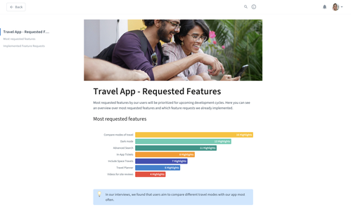
- Highlights: The chart will show the amount of created highlights for your content. For example, you can show how many highlights exist for specific tags.
 Sessions: The chart shows the number of sessions that are associated with the chart content. For example, you can visualize in how many sessions a tagged feature request came up.
 Participants: The chart will show the number of participants that are connected to your chart content. For example, you can show how many participants fit your personas.
Add a title to your chart that explains what is displayed.
Refining charts
With the following options, you can further refine how your chart looks.
Bar or Pie chart: Click on the chart icon to select if you want to display your chart as a bar chart or pie chart.
Change chart colors: If you want to change the chart colors, click on the
 edit icon beside a single bar (or pie section) and select a color.
Hide single elements from your chart: If you want to remove single elements from your chart, click on the
edit icon beside a single bar and click  hide.
hide.
Using charts in Artifacts
Drag and drop: Simply pull a chart to the Artifact with drag and drop. The data in your chart stays live. That means the chart will always show the current status. When you add new research data that refers to the parameters of your chart, you will see the update immediately.
Download and import: Alternatively, you can download the chart as an image and upload the image to your Artifact.
Embed a chart from Datawrapper: If you wish to upload a more complex chart than Condens supports (e.g., from large datasets), you can create one using the Datawrapper tool and bring your external chart to Condens.
