
Creating an engaging user research presentation
To be perfectly honest: We at Condens are not the greatest fans of making stakeholders experience user research only through presentations. Given the chance, we’d always opt for involving stakeholders throughout the research process which is much more effective in achieving a common understanding.
But we also know that this is not always possible due to time constraints or if you want to share findings beyond the core team. In this case a presentation can be a useful tool.
There is already a lot of great material about how to give good presentations in general (opens in new tab), choosing a story outline (opens in new tab) and effective body language (opens in new tab) - no need to replicate that. That’s why this article focuses specifically on presenting findings from user research.
It starts with the characteristics that make user research presentations particularly challenging, explains how to structure the presentation and then gives practical examples of effective slides.
Note: You can download the presentation with example slides here (Google Slides (opens in new tab) or PowerPoint (PPTX)).
Challenges of user research presentations
Delivering a good presentation is never easy no matter what it is about. On top of that, there are some difficulties that are unique to presenting results (opens in new tab) of a UX research study. We will explain these difficulties below and give some solutions to overcome them.

Challenge No. 1: Distrust in qualitative data
Especially colleagues with data science background are often sceptical towards qualitative research results and their explanatory power. The typical chain of reasoning is that findings are not statistically significant (which is often true) and therefore don’t hold any value (which isn’t true).
An approach that Christopher Nash from Dropbox uses when sharing findings with sceptical stakeholders is to be very explicit about the shortcomings of qualitative research. This sounds counterintuitive at first as it seems to weaken one’s position, but it actually helps. Christopher’s explanation is that the skeptics are particularly worried if findings are presented with overconfidence and admitting certain shortcomings lessens this worry.

Challenge No. 2: Conveying the participant’s perspective to stakeholders
A large part of UX research is understanding the viewpoints of people. This often involves feelings and emotions. Conveying these viewpoints genuinely such that the audience fully comprehends them within the limited time of a presentation is difficult.
An effective way to address this is to show clips of audio or video recordings during the presentation. Firstly, this increases credibility as stakeholders hear and see evidence directly from the participant and not filtered through the researcher. Secondly, it retains the richness of information including gestures, facial expressions and tone of voice which jointly form a stronger image in the head than any abstract summary could.

Challenge No. 3: Keeping bias under control
Researchers not only need to be aware of their own bias when running a study, they also have to be mindful of not prompting and fueling bias among their audience. The way findings are framed during the presentation has a large impact on the audience’s perception and the challenge is to not lead colleagues or clients down a wrong path.
To counter this risk be particularly careful how you formulate conclusions. Don’t only state what the results show but also what they don’t show and give guidance how to further use the findings.
In addition, it helps to remind stakeholders that research is about gathering information, not producing absolute truths. The goal is to increase certainty about a hypothesis but it will not yield perfect clarity.
Challenge No. 4: Inspire action
One of the most frustrating experiences for a researcher is if their work doesn’t have any impact. You may have done a great job conducting the research, coming up with findings, creating a compelling slide deck and giving a stunning presentation. But all that is worthless if the results don’t lead to any specific action.
Colleagues or clients may disregard research results for multiple reasons. Besides distrust in the data (see challenge 1) and a too shallow understanding (see challenge 2), scientists found out decades ago that the level of personal trust between the researcher and the audience (opens in new tab, PDF) plays an important role.

Chiesha Kaihani, a research manager from San Diego with a background in psychology, has realized this early on and advocates to build “genuine friendships with stakeholders whenever possible”. Trust is built on credibility and a central prerequisite to get people to act upon research results.
With a bit of experience you will learn to anticipate the challenges you are going to face and can adjust the presentation accordingly.
Structuring a user research presentation
A good presentation structure takes listeners by their hand and guides them through the talk smoothly. The goal of the structure is to create a logical sequence that makes it easy for the audience to follow and provides orientation to understand information in context.
Below are four tips for an effective structure and an example outline commonly used for UX research presentations.
Keep it short
The working memory of human beings can only store three or four things at a time. Instead of presenting all the findings from a study, focus on the 3 key points your audience should walk away with.
Resist the urge to share everything that the study revealed. We know you put a lot of effort into the research, but don’t diminish the key findings by overwhelming the audience with too much information.
Present information sequentially
Show one piece of information at a time and allow listeners to process what they hear. This means only having one main idea per slide to avoid information overflow.
Then, organize slides such that each piece builds on the previous ones and helps the audience to gradually see the bigger picture. The audience should always be aware how the currently discussed topic fits into the context of the entire project.
Set a goal up front
Starting the presentation by clearly stating what you want to have accomplished by the end of it is generally a good approach. An example could be: “After this presentation and the following discussion we want to have a decision which prototype to go with.”
This provides an imaginary finish line and definition of success everyone can orient by. If the goal has been achieved it means the meeting was productive and - almost equally important - it feels like it as well.
Be clear about when questions should be asked
Usually there are two ways to handle questions. The first is to allow questions during the presentation. This allows to resolve possible confusions early on and ensure everyone stays on board. On the other hand, you may lose attention especially if the questions are very specific and not relevant for the entire audience.
The second approach is to ask listeners to save questions for the end. For larger audiences this approach is suitable as it doesn’t break the flow and some questions may sort out in the course of the presentation.

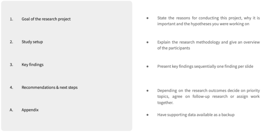
Here is a common outline for user research presentations. It starts by introducing the goal of the project and the study setup. The findings make up the central part and it ends with recommendations and next steps.
Visualizing user research insights in slides
This topic is deliberately covered at the end of this article on purpose since it should also be the last step in preparing a user research presentation. Defining the overall message and structure first will save a lot of time because you know what it is you want to visualize.
Below you find some typical slide visualizations which you can use as an inspiration for your own presentation.
[Download the full slide deck here as Google Slides (opens in new tab) or PowerPoint (PPTX)]
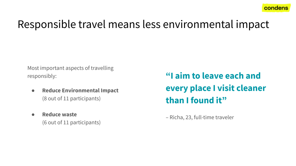
Key finding slide with quote
In this slide the headline describes the key finding and there is an exemplary quote as well as a more detailed description below. It’s ok to edit quotes for clarity and brevity. Including additional information about the participant – in this case the name, age and user segment – allows the audience to understand the quote in context. The slide also displays how often a certain topic was mentioned, which is common practice especially to identify outliers.
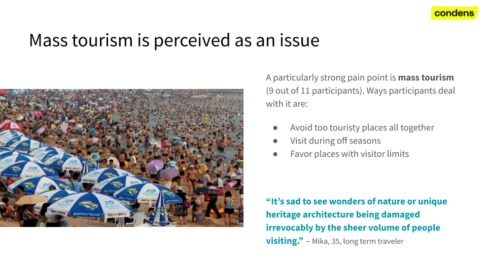
Key finding slide with image
This slide has a similar layout with the key finding in the headline, but uses an image that a participant provided to empathize the message and add more detail. Showing the participant in action, their typical environment and screenshots from designs make good images for presentations.
Key finding slide with video clips
Showing video clips is a great way to convey information in its full richness. Don’t share the entire recording, but create a curated collection of clips which contain the key scenes. You can also combine multiple sequences about the same topic into a highlight reel.
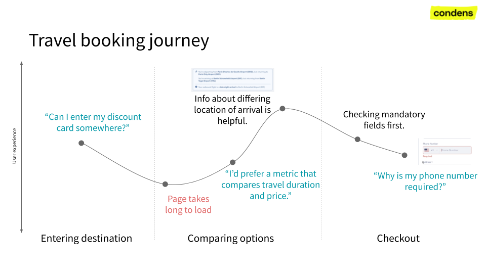
User journey map
A user journey map can make a good slide to provide an overview of a process. Depending on the complexity, it may make sense to hide the map at first and reveal each step sequentially to not overload the audience. You may also have follow up slides that show each journey step in more detail and provide further examples.
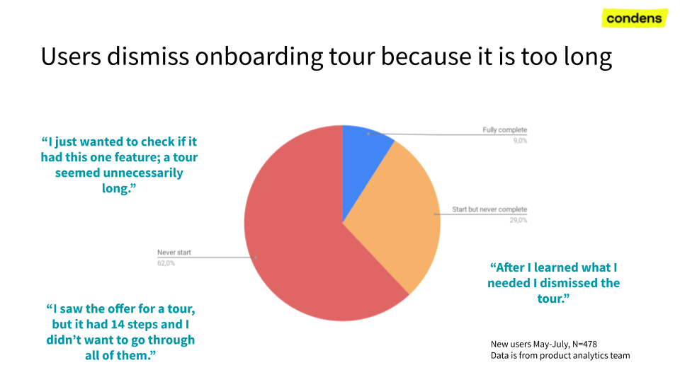
Combination of qualitative and quantitative data
This is an example where quantitative data from product analytics is combined with qualitative data from user interviews. The quotes from the interviews show up next to the respective group in the chart to illustrate the users’ motives.
Want to read more? Check out the articles about note taking(opens in new tab) and user interview analysis(opens in new tab).
