Double down on the emotional depth of UX research findings
As UX researchers, we are often urged to quantify our qualitative research findings to give them credibility. There’s a high chance that you get confronted with questions like “How many people said this?” or even "What percentage of participants said this?" when presenting your qualitative UX research findings. In this article, we will examine where this urge towards quantification comes from and learn about strategies to cope with this push when doing qualitative research. Also, we will share industry tips by Max, one of our founders who worked in a fast-growing tech company as the first UX designer in a previous job.
Urge for quantification
Many company settings already have a strong quantitative culture. While this has many benefits, it can lead to the urge for quantification even when doing qualitative UX research. One researcher told us that the strong data science team in their organization shaped the tone of how research insights are communicated. Another example of the deeply rooted quantitative mindset can be found in Nasa’s famous mission control room, where posters are claiming: In God we trust, all others bring data. Commonly, research insights are associated with big data, diagrams, and graphs, and people have learned to think of users as large data sets. All this leads to colleagues and stakeholders expecting charts and graphs when compelling stories or emotional insights might be the better tool for the job.
A figure represents the truth - that's a common belief. However, this is no absolute truth but rather misses the inherent strengths of qualitative research, which can be a solid basis to make good decisions. So how do you handle questions such as "What percentage of participants said this?" when all you have are qualitative findings? Answering "40% of our participants believe that..." when you've only talked to a few people is not a good idea. To be clear: Quantitative data has many inherent strengths and is an excellent supplement to qualitative data. Quantification should just not be used as the primary means of communication for qualitative data.
Presenting qualitative UX research findings in quantitative ways has two main issues:
- Pressing qualitative data into a quantitative frame gives you a hard time keeping up with actual quantitative findings; you're playing a game you're bound to lose.
- And much more importantly: you’re depriving yourself of the most powerful tool you have as a qualitative researcher.
So instead of squandering the full potential of your qualitative research by giving in to the pressure of quantification, rather go the other way: double down on the emotional depth of your findings to generate impact and convince stakeholders to act.
Emotional depth - and the role of videos
As a UX researcher you have already interviewed users, observed user behavior, or conducted usability tests to get the insights in the first place. Going through all this work and then not using audio or video when sharing results just leaves so much value on the table. Let’s look at an example. During interviews with different traveling types, a specific concern was observed. One of the participants, Jessica, described her experience:
She shared that she was worried about extra charging while running late for a flight the first time. But now look at the exact quote and how Jessica describes this event and how she experienced it.
Different, isn't it? According to psychologist Albert Mehrabian, the spoken word accounts for only about 7% of communication. The rest happens through other non-verbal cues. The audience will receive plenty more nuances of the user’s experience when seeing them in a video. You can receive signals about the emotional state of the users/participants, like spotting points of confusion, insecurity, or excitement.
Some examples of emotional cues that you can’t get just from the text are:
- face expression, body language… sometimes really subtle,
- the tone of voice,
- intonations,
- pauses,
- speaking rate,
- and probably a lot more 😉
By showing video clips, you can convey information in its full richness. Most people can pick up these signals intuitively. It will be much easier for your audience to understand the research findings when seeing or at least hearing them from real users. This can serve as a quick entry ramp for a deeper discussion and thought process about the key insights.
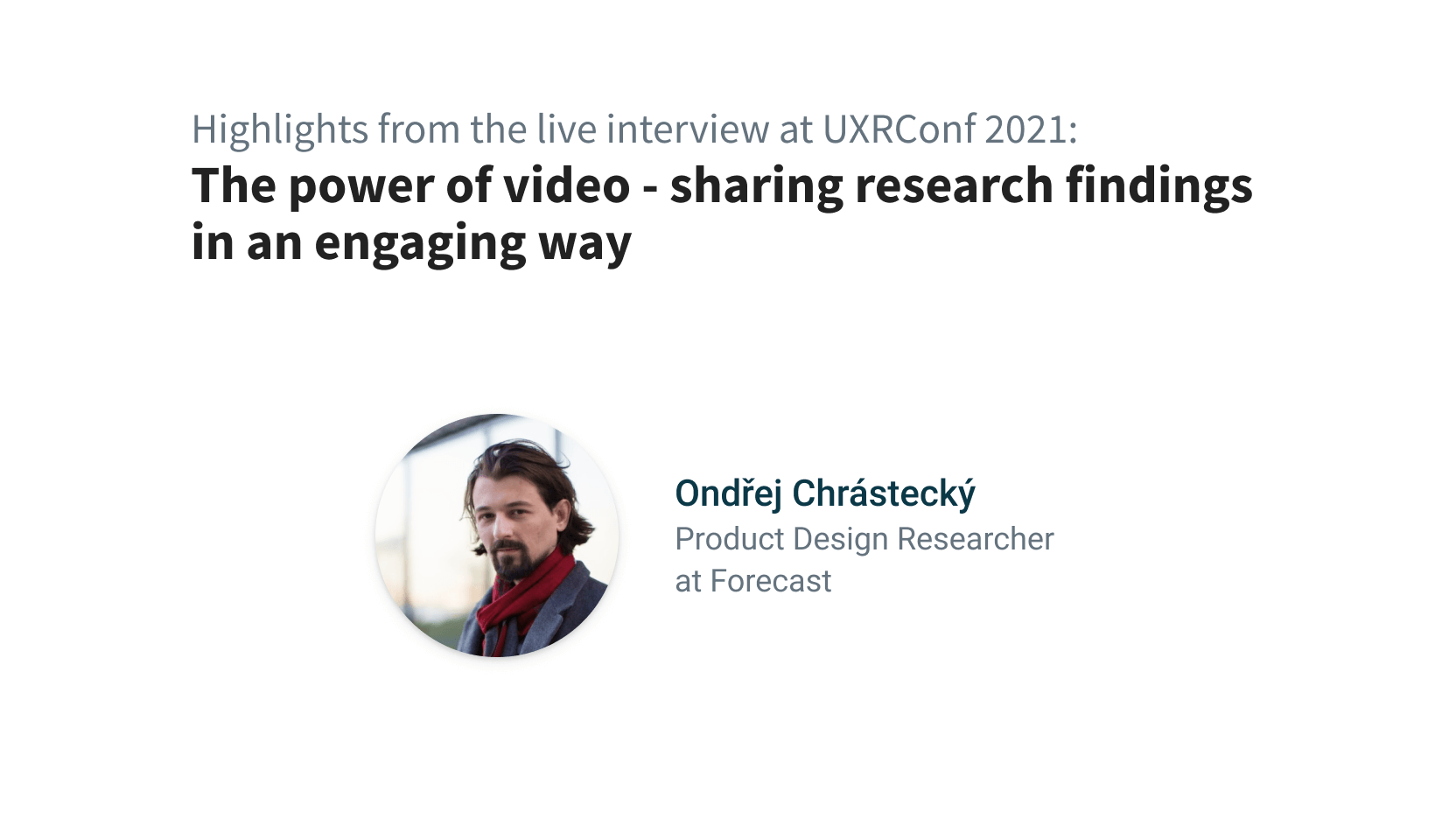
We talked to Ondřej Chrástecký, Product Design Researcher at Forecast, how recordings support UX research at their team:
Note: If you are using videos in your presentations but find the workflow with general-purpose video tools like Adobe Premiere or MovieMaker too cumbersome, then we recommend you give Condens a try. You can create downloadable audio and video highlights that you can use in your presentation. The workflow is designed to analyze user research data, so it is way faster and more enjoyable to create your highlight snippets.
How to bring the depth of research findings to my organization?
There is certainly no one-size-fits-all guide for this. Nevertheless, we’ve tried to put together some general strategies that can support you when you want to use video recordings to strengthen the emotional side of your research findings.
Remove yourself as an opinion holder
… and therefore as a potential critic of your colleagues’ work. Let the findings speak for themselves. It might be counterintuitive, but it is often easier to achieve improvements for users if you are on your colleagues’ side instead of ‘fighting’ for your users.
Discover findings together
Invite your team to participate in research activity: Nothing is more convincing than the findings you found yourself. Plus: uncovering research as a team is a great experience and an excellent starting point for fresh ideas and improvements.
Make UX research findings accessible
Share your findings online and be open about them. Try to build your insight deliverable (e.g., your slides) in a way that the findings can be understood without further explanation but are still easy and fast to digest. That can help you reach parts of the company that never attend your presentations with your findings.
Be open about your raw data (in a way that complies with company policies of course): It builds trust if stakeholders can potentially see raw material - even if they rarely make use of it.
Make sure to include the positive things: Often, good UX is not easy to notice as it is often 'only' the absence of issues. Make sure you highlight these findings, too. You can also take in some findings from past research to showcase the progress your team has made since.
‘Movie Night’ Presentation
To bring it all together, we want to share a format that Max, one of our founders, implemented in his previous job. The basic assumption was that sharing qualitative user research findings should be fun and exciting - instead of consisting of a dull report. That's why he came up with what he called movie nights. While this was originally done in person, it also works great for remote settings.

Here is what he learned from this experience packed in a checklist & some tips. Feel free to use this for organizing your own movie night to convey the emotional depth of your findings:
Preparation:
- Snacks - Snacks and something to drink work wonders to create an open and relaxed atmosphere. Bring some snacks or invite your colleagues to come with their snacks when facilitating the event remotely.
- Equipment - Make sure you have the right equipment (e.g, a large TV or projector and speakers) to facilitate the movie night properly. When conducting this format remotely, you can stream snippets for all or show your video via screen sharing.
- Pens, Paper & Post-its - or any digital whiteboard set up - just in case 😉
- Time buffer - Plan for at least double the time your presentation would take. It’s the best time to create actionable plans. Use the urgency and motivation that is now the strongest as everybody experienced the real users’ experiences as close as seldom before.
- Media snippets - Preparing video highlights for your presentation takes time and effort, but it is well worth the effort. Don’t share the entire recording when presenting, but create a curation that supports your key findings. When possible, create supercuts to show the same problems by different users: This indicates that it is not one loner having this problem.
Movie presentation tips:
- Introduce each participant properly
Let them be the protagonists of your story. It’s easier to empathize with people you know the name of - if you don’t want to use the real names of your participants, you can give them nicknames. - Don't take being the user’s advocate too seriously
Do not defend your participants too offensively. Strike the balance between creating empathy and understanding for users that might have a different background from your stakeholders and still "stay on the same team" as your stakeholders. - Bring everyone on the same level
You can remind everybody that we are all users from time to time and therefore not as familiar, experienced, and committed in the usage of products (yourself included). - Collaborate
Collaboratively analyze what was happening, sometimes it is not apparent what is going on (weird bugs, weird system behavior...) and build a shared understanding of the user's needs and problems.
While this approach worked great for Max, we are sure that there are other ways to
approach the conveyance of emotional depth when sharing research insights. That’s why we
want to hear from you:
How do you convey the emotions of users/participants when presenting qualitative UX
research findings?
We would love to hear your experiences - get in contact via
LinkedIn
or hello@condens.io.
Want to read more? Check out our articles about creating an engaging user research presentation and making UX research accessible.
