Online Affinity Mapping in UX Research: 9 Tips on How to Come to Actionable Insights
When you conduct qualitative UX research, you often end up with a large number of isolated pieces of information that are not actionable yet. For example, from a range of 12 qualitative user interviews, we collected more than 360 relevant statements, but they don't tell us anything - yet. So while we can build averages, means, and correlations with quantitative data, we have to apply different tools for qualitative analysis. Affinity Mapping is one way to come to actionable insights from qualitative user research data. It's a flexible method that can be applied in person and online. We'll walk you through Affinity Mapping and share nine tips for Affinity Mapping with a particular focus on the virtual setting.
- Affinity Mapping 101
- What is Affinity Mapping?
- When to use Affinity Mapping in UX Research
- Its origin
- Online vs. Offline Affinity Mapping
- 9 Tips for Online Affinity Mapping
- 1. Prepare the data
- 2. Start with one first cluster and continue from there
- 3. Repeat the process
- 4. Examine outstanding phrases
- 5. Zoom out and look for connections
- 6. Make use of available meta information
- 7. Include team members and stakeholders
- 8. Conduct synchronous AND asynchronous sessions
- 9. Turn the Affinity Map into a shareable deliverable
- Wrap up
What is Affinity Mapping?
Affinity Mapping is one method to synthesize and structure qualitative research data to discover patterns and meaning in collected qualitative user research data. In simple words: It's a way of processing qualitative raw data to turn it into something useful. So whenever you have a bunch of collected data points or ideas and need to distill them, this method is a helpful tool.
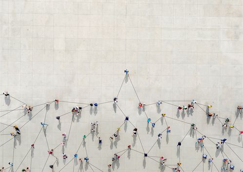
The easiest way to understand Affinity Mapping is probably by looking at one example of an Affinity Map:
In UX Research, an Affinity Map is a visual representation of data from notes, recordings, transcripts, text documents, feedback forms, and more. It structures available data and provides an understandable overview. It makes the data easier to grasp and helps you find insights and connections that were not apparent at first glance. For example, in the affinity map shown, we started with over 300 statements from a generative interview study about travel experiences and different types of travelers with 12 participants.
To achieve an Affinity Map in the end, you arrange qualitative user research data from multiple sources and methods into groups. That means you organize the available data by themes, trends, and affinities. Most of the time, the Affinity Mapping process can be messy. Or in other words: it's a flexible process. But don't shy away from that. In our opinion, this is normal if you don't know the outcome yet - so it's a good thing and allows you to come to an unbiased result.
When to use Affinity Mapping in UX Research
Affinity Mapping is a helpful method when you wish to:
Provide an overview of new, wide-ranging, or complex observations
Answer specific research questions
Discover connections or relations among data points that aren't easily discoverable
Understand underlying or hidden patterns that aren't explicitly mentioned but guide the actions of people
Identify priorities of topics and critical and negligible areas based on the available data
Generate ideas about design recommendations for a product a service
To clean up with this, it's not the goal to make quantitative statements. There are other analysis methods for that, and - more importantly - you probably need to build this outcome based on other available data.
Its origin
Affinity Mapping is also referred to as Affinity Diagramming (because the outcome is often a visual representation of the grouped data) or the K-J method (it relates to its creator, the Japanese anthropologist Jiro Kawakita). Besides making sense of user research data, it is also well known as a method to organize information in general. For example, Affinity Mapping gets applied in brainstorming sessions or when mapping information to a particular structure, like in a SWOT analysis.
Online vs. Offline Affinity Mapping
Even if you strongly prefer working in person, using digital tools simultaneously is not a contradiction: you can either be in different locations or be in the same room but work with digital tools simultaneously to streamline the UX Research work.
While there are benefits to conducting Affinity Mapping with pen and paper on a wall (like the added value of movement during creative sessions), there are benefits to the virtual version as well:
⏩ It’s faster: Making digital notes often speeds up the process as gathered data is usually already collected digitally and can be copied. In addition, manually duplicating data points is unnecessary for different rounds of Affinity Mapping.
📝 It’s recorded by itself: The outcome is documented automatically with online Affinity Mapping. In addition, it’s also possible to easily record different stages of the process.
🌐 It’s remote-friendly: Mapping affinities online is remote-friendly and allows more people to join quickly. It can also be a plus for including stakeholders who don’t have much time available.
🔄 It’s more flexible: Starting over or rearranging many notes at once can happen in a few clicks. In addition, online, there’s always as much space as you need, and usually, you can extend a board in any direction. Another benefit is that you can continue or process the outcome anytime without blocking the whiteboard in the meeting room.
9 Tips for Online Affinity Mapping
When creating an online Affinity Map, here’s how to make the most of available user research data and ideas.
To make the tips that follow below easier to understand, we added some concrete examples of how we used them in an actual research study. The study consists of interviews with 12 people about their travel experiences and preferences.
1. Prepare the data
Highlight interesting phrases or notes in your raw data and bring the information to movable notes. Aim for one note per statement. When using Affinity Mapping in an ideation session, start with presenting the question or problem and then collect all ideas on movable notes.
To analyze gathered data from a travel experience interview study, we transcribed participants' interviews and created research highlights in Condens. From there, we had all interesting statements and observations directly available to start mapping affinities.
2. Start with one first cluster and continue from there
Put all notes on a digital stack, pick the first note and open a cluster. Take the second note and add it to the cluster if you spot a similarity. If not, open a new cluster. There's no right or wrong with what you define as the group's commonality. However, it's always a good idea to start by grouping commonalities around the topic of your research questions.
Continue the process with all notes. At best, name clusters and pay attention to emerging themes. Finally, move through all notes by adding them to existing clusters or creating new ones.
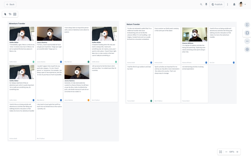
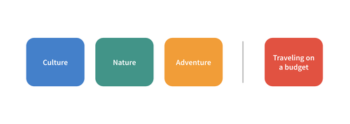
We spotted different mentioned activities and traveling styles among our research highlights. The grouped affinities allowed us to identify the first types of travelers we want to keep in mind as an indicator for refining and developing user personas.
3. Repeat the process
Often the power of Affinity Mapping lies in its repetition. So start all over to find new connections and look at the data from new perspectives.
After spotting the first traveler types grouped by different activities, we also found other ways to group observations. For example, we identified another theme around planning trips on a budget unrelated to travelers' general preferred activity level.
4. Examine outstanding phrases
Which notes are hard to cluster? And why? Often these are the ones that point you to an interesting pattern in your data. Combined with the previous tip, this can be a powerful way to discover hidden patterns that aren't explicitly mentioned in the available data.
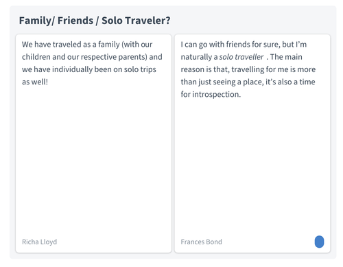
In our example, we had some outstanding phrases about with whom they traveled last. The participants' statements pointed us to the wide variety of travel partners. The interviewees directly referred to other constellations for past trips when speaking about their last travel partners. So we learned that there might be a general traveler type regarding the preferred activities and activity level. Still, the number of travelers and constellations (from solo trips to family vacations) must be considered separately.
5. Zoom out and look for connections
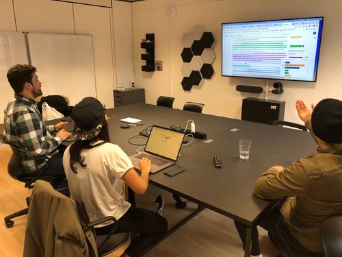
Don't forget to zoom out, especially when you've moved through your digital stack of notes. Slip into the high-level view and look at created clusters, themes, and lone wolves. This simplified view allows you to view patterns on a larger scale and consider how the groups relate.
Take a moment to reflect on emerging themes at discovered themes and try to understand how different clusters can be connected, how they relate to each other, and how they affect the next steps. Then, if it makes sense, move entire groups and draw lines from the zoomed-out perspective to structure your map.
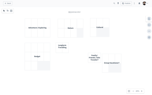
This affinity map is created in Condens. Learn more about using Condens as your digital whiteboard for UX Research analysis and more here.
6. Make use of available meta information
Especially with digital tools, you can easily include contextual information in that step. For example, pre-sort notes by participants’ location, role, or available device (or other meta-info relevant to your study). This step can uncover new patterns and makes it very easy to look at the data from new perspectives and varying starting points.
7. Include team members and stakeholders
Consider including team members and stakeholders across your organization to make the most of an Affinity Mapping session. It’s an activity that can be ideally conducted alone or as a group activity. It’s a fantastic opportunity to engage others with user research observations without being part of all research sessions and to bring in more perspectives to learn from the available data.

8. Conduct synchronous AND asynchronous sessions
Mapping affinities virtually as a group can happen in a joint session and asynchronously, meaning multiple people work on the same Affinity Map when they find a good time. Mapping affinities async can be a valuable activity that allows participants to return later after processing information and helps prevent groupthink. It’s also a great way to efficiently involve collaborators working in other timezones.
9. Turn the Affinity Map into a shareable deliverable
After mapping affinities on a digital board, you can quickly turn them into shareable deliverables. For example, an Affinity Map can be an excellent base for a user persona or journey map. The map makes it easy to keep user research data accessible and readable and allows people to dive deeper anytime.
For the travel experience study, we used Affinity Mapping to create multiple research insights to share with the team. In addition, we created a research report that presented the full map next to the study overview and a summary of learnings, recommendations, and next steps. The added visual made the piece more interesting to explore and offered an additional way to grasp information. Everyone interested in diving deeper can easily read or watch highlights from the research data instantly and in the right context.

Wrap up
Affinity Mapping is one way to come to actionable insights from qualitative user research data. Its flexibility allows you to conduct it as a group activity, in individual work, with pen and paper, or online. Digital Affinity Mapping has some particular peculiarities and can be especially useful to speed up the process, involve team members from other locations and adapt it precisely to your research analysis setting. Here are some best practices to remember for the next session:
Prepare the data.
Start with one first cluster and continue from there.
Repeat the process.
Examine outstanding phrases.
Zoom out and look for connections.
Make use of available meta information.
Include team members and stakeholders.
Conduct synchronous and asynchronous sessions.
Turn the Affinity Map into a shareable deliverable.
Condens helps you analyze user research data and conduct Affinity Mapping online to make sense of data the way you're used to. Explore even more options to cluster user research data on a digital whiteboard. Let Condens be your digital post-it wall, and start a free trial for your next UX Research project. 🔎

Sina is a UX Researcher and Content Strategist at Condens. With a background in social media strategy and digital transformation, she learned how to engage with people in developing products and services and why putting the users in the center will lead to more substantial outcomes and superior user experiences. Sina is excited to drive user research at Condens and to enable better user research for others at the same time by bringing their perspectives into the product development of Condens and by creating valuable content for UX Researchers.
